Sigma Computing

As part of the larger “Fit & Finish” initiative, the team decided to take on the UX to style Workbooks as well as deliver some fresh, new, one-click themes for users to select from for quick configurations. We decided to focus on the inspector panel (the left hand portion of the Workbook) and the themes themselves.

overview

my role

I helped the team define what we would focus on, as well as doing the initial conceptual UX and UI for the project. I handed this off to Stephen and Simin once the team aligned on the approach and scope.

THE TEAM

Stephen Del Valle (Lead VisDe)
Simin Gu (Senior Product Designer)

TIMELINE

I set this project in motion approximately 3 months prior to my departure. While not yet shipped, the samples below are current and are planned to be delivered sometime in the first half of 2024.

problems

My hypothesis is that pixel-perfect isn't the main blocker to replacing exec dashboards. It's more about responsiveness, usability, and (most important) the ease of making something analysts feel comfortable showing to their bosses.

We're going to need to resist the urge to add endless configurations, and focus more on delightful defaults.

where we started

  • Default "Workbook Settings" panel
    The flow represented here is using the current production UI.

  • Theme selection
    Users struggle with theming Workbooks. Out of the box, Sigma provides several themes out of the box. With the exception of the light/dark categories, the differences between the themes are subtle and rather washed out.

  • Theme changed to "Dark"
    The theme changes immediately upon selection. A good part of this UX is that the user does not need to explicitly save. All changes can be undone/redone.

  • Theme browser
    Subtle differences between the themes in the light and dark categories. A lot of clicking is needed to see the collection of “Meh” options.

  • Custom theme
    The options for this theme will allow the user to create a complete theme. However, the vast majority of people don’t want to spend the time working at this and/or don’t choose colors and fonts that are pleasing and harmonious.

our approach

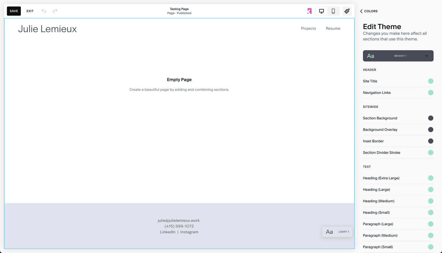
We observed that consumer website-building UIs were the closest and most accessible analogs for how people use Sigma to style their analytics dashboards. After a significant amount of research and product evaluation, we chose Squarespace as the model for the redesign. From Sigma Design's Operating Principles:

Our product look & feel must match Sigma’s positioning in the market as a modern BI & analytics innovator. Sigma is a modern, cloud-native BI and analytics product. Our design philosophy favours light, airy, vibrant and spacious interfaces. Our components are drawn from the best open-source libraries. Our in-product artwork is clean and relevant to how we wish our product to be perceived in the market. If designs resemble traditional enterprises or one of the products we wish to displace in the market there are better designs for Sigma. We can borrow in small measure from the best of the best when warranted. 

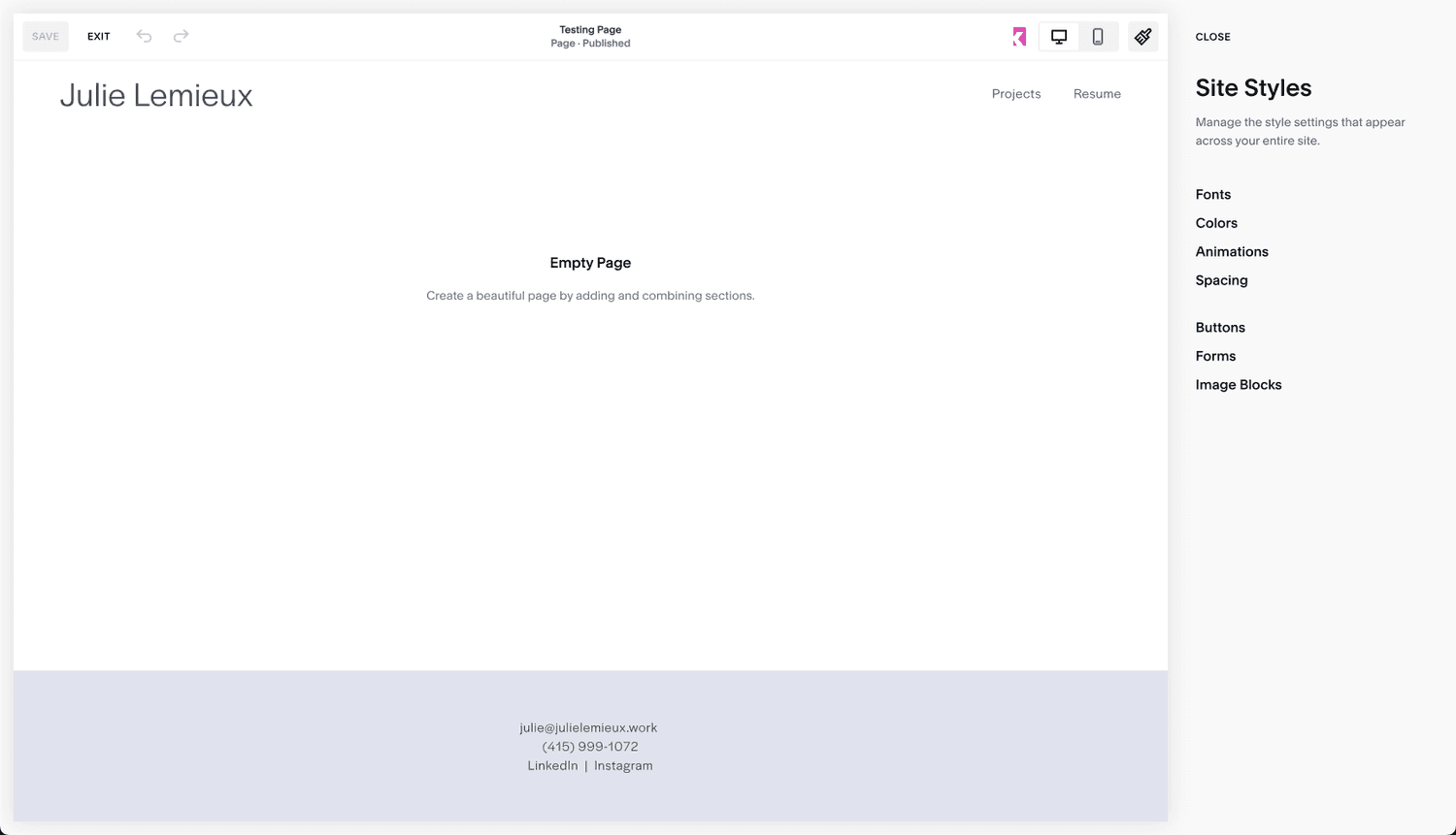
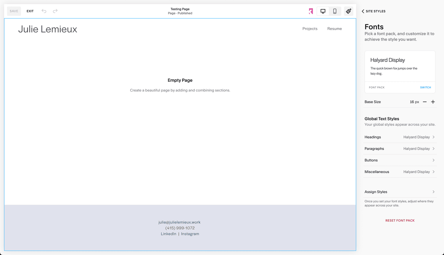
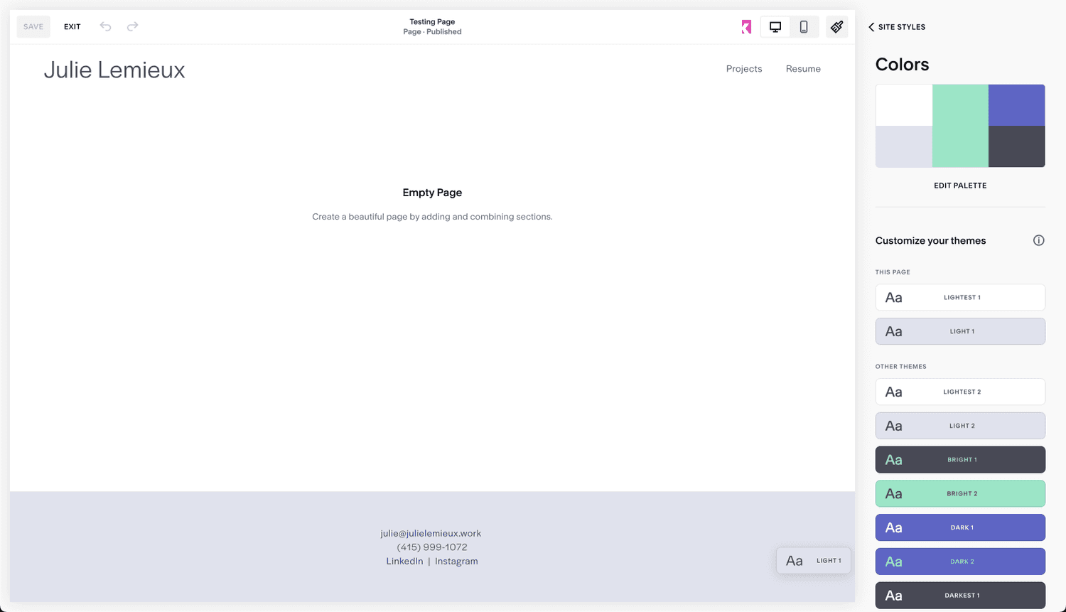
Squarespace Evaluation
  • Focus on navigation and picking the right area to customize
    The biggest differences between Sigma’s and Squarespace:

    - No controls on the initial navigation panel
    - Significantly more whitespace
    - Bigger fonts

  • Focus on one styling element at a time
    Users in Squarespace focus on ONE styling element at time. They do not need to look for an parse the various elements in a dense panel to (maybe) find the one that they want to change.

  • Themes
    The theme selection UI in Squarespace has a UX that is largely the same as Sigma. The main difference is that they dedicate the entire panel to browsing, selecting and editing the desire theme. The colors pop more. The combination of the colors is far easier to understand and evaluate.

  • Editing theme colors
    Sigma’s color options are far fewer than Squarespace, yet there is something interesting to learn here: which is that they categorize the UI elements that can be customized.

conceptual designs

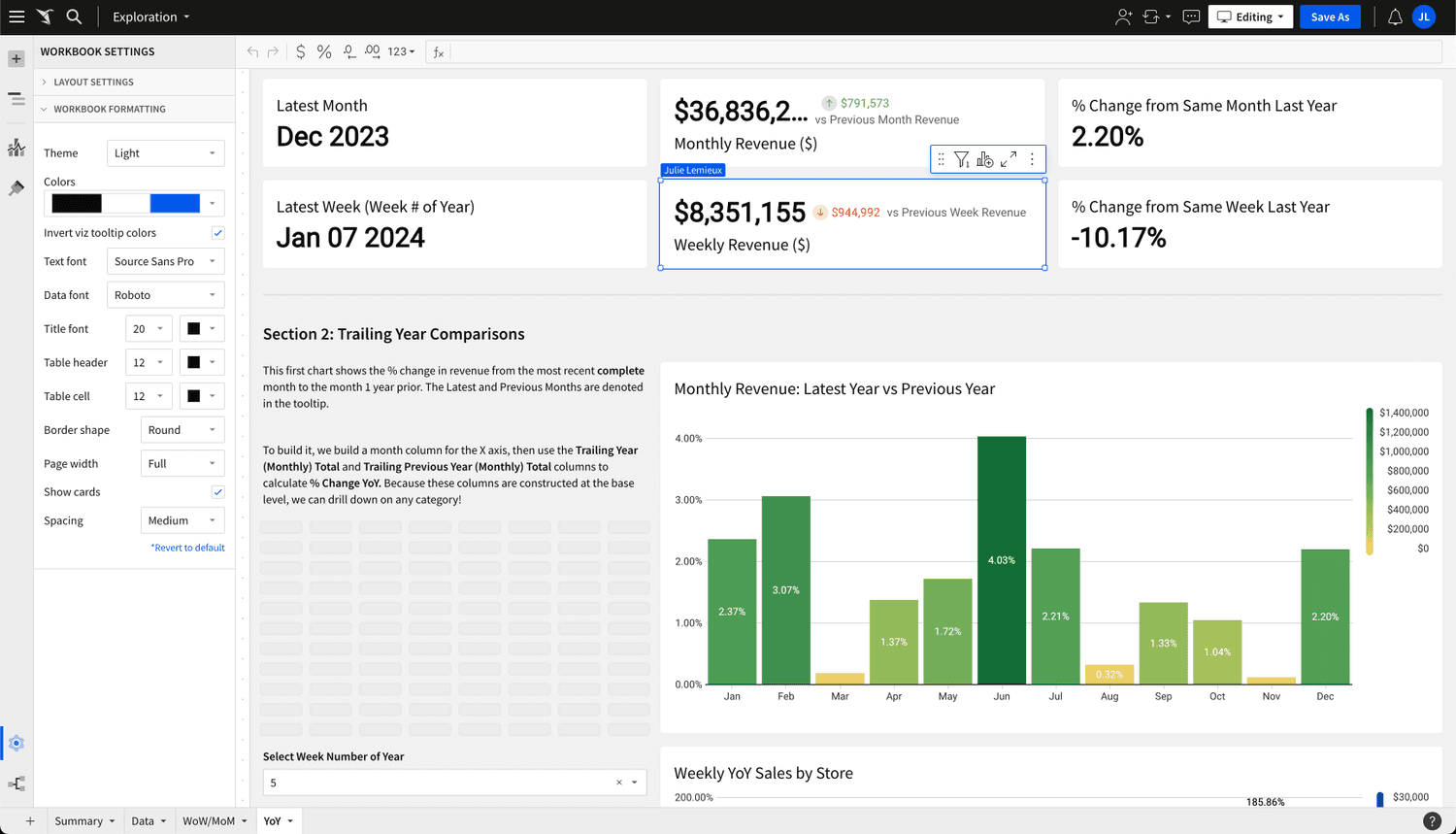
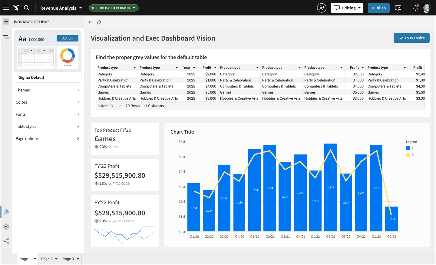
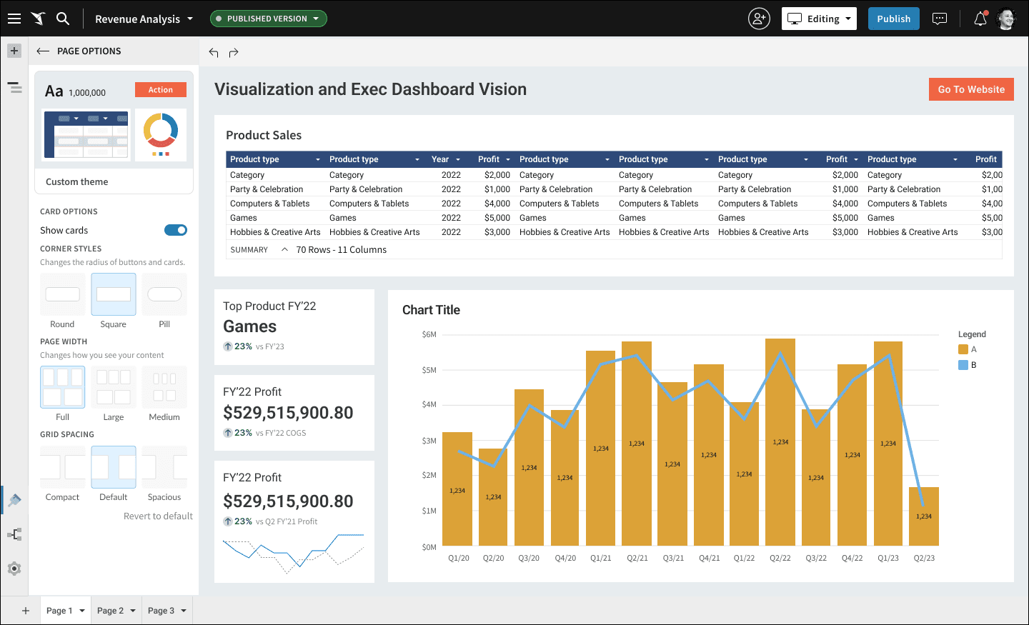
While my team worked on different priorities, I got ahead of them and started to lay down the initial designs to see if what we were thinking actually worked and would deliver the value to the users we planned. I worked using the current production UI as the new chrome designs were in progress and not yet available for me to work with. I also chose to use the existing UI so that in the event that engineering could start on the designs ahead of the chrome UI being ready, we could deliver this value prior. Spoiler alert: this didn’t happen and the new styling isn’t yet available in production.

  • Styling Panel
    With the exception of the preview card at the top of the panel, I stayed with the navigation-only principle.

  • Theme selection
    As part of a fun Design Critique session, I had the team come up with fun themes that I could use in my conceptual designs. Adult beverages may or may not have been involved I categorized them so that the user could scroll and browse the categories by theme.

  • Theme colors
    Each theme ships with default colors that can be customized. Sigma doesn’t have nearly as many UI elements that can be themed, so this panel is simple by default. Theme-appropriate chart colors are part of the bundle.

  • OOTB Color picker
    We planned an overhaul of the UI for this popup to make it bigger and offer the user the ability to work with a color wheel as well. Its seemed like a low priority to persue.

  • Fonts
    I carried the concept of the preview card through to the font styling for consistency’s sake. I remain unsatisfied with the card UI - I think its cluttered and could be far clearer. Perhaps each type element could get its own card instead of having them all in one.

  • Type styling menu
    I try not to innovate in places where it doesn’t deliver any new value to the customer. No innovation here.

  • Table Styles placeholder
    In parallel to my conceptual designs different members of my team were working on designs for a new table styling feature. I worked with them to include all of the UI affordances they were planning to include. This was done for continuity and to give that team a place to work on their designs in the context of the larger styling UI.

  • Page Options
    Many of these selections were scattered in a few different panels. They were all related to page display options, so we created a dedicated panel to house them as they are all categorically related.

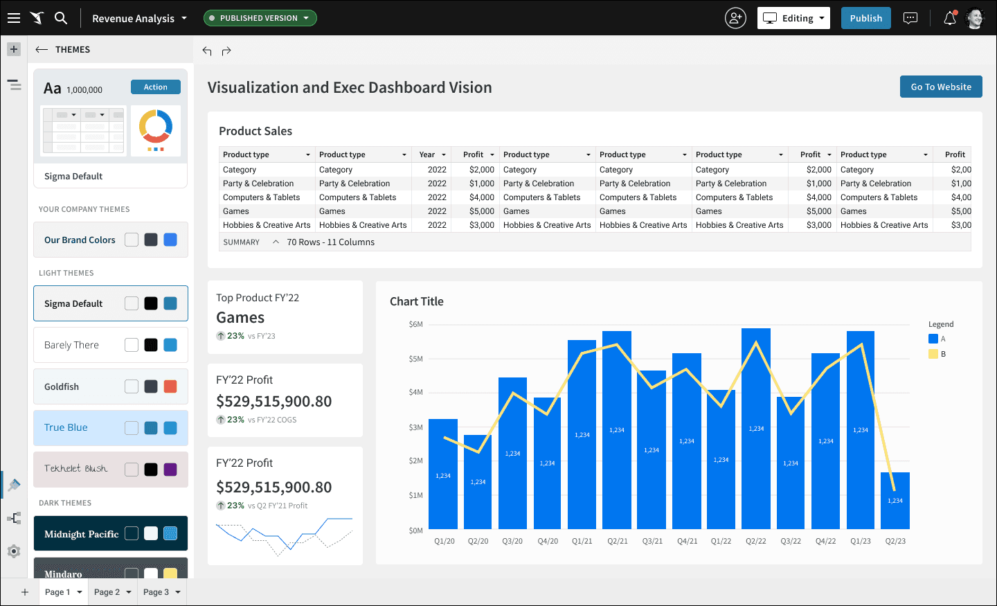
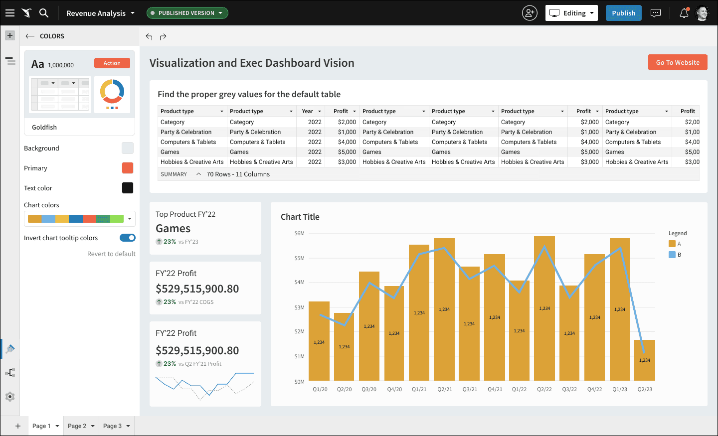
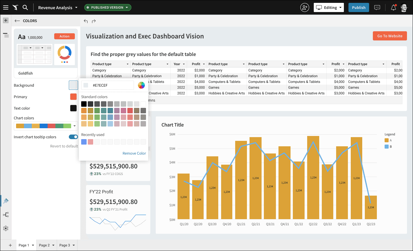
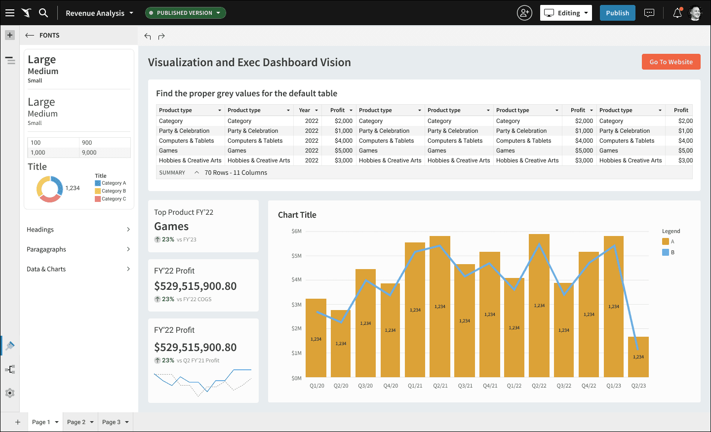
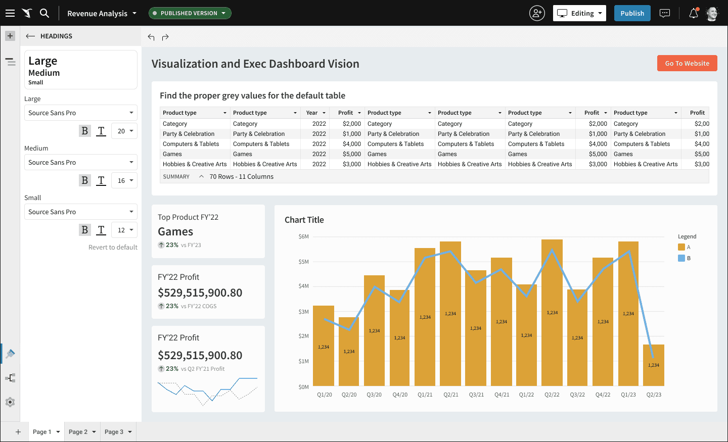
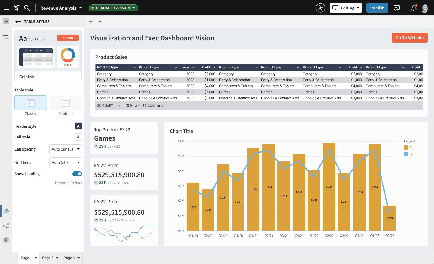
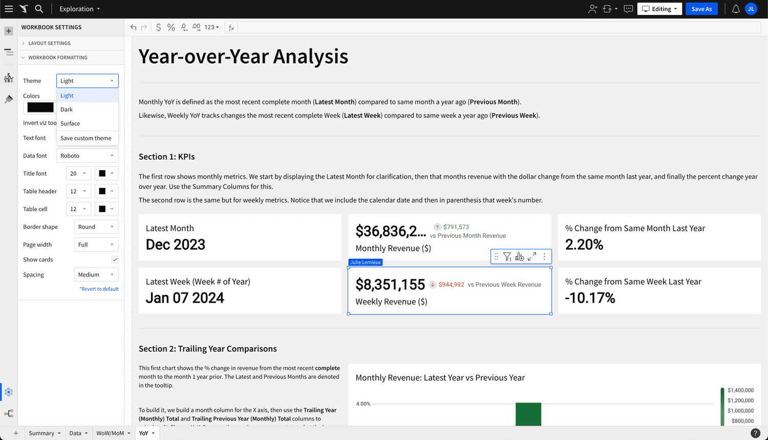
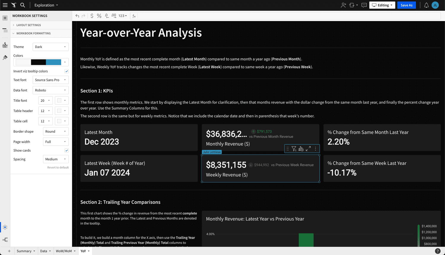
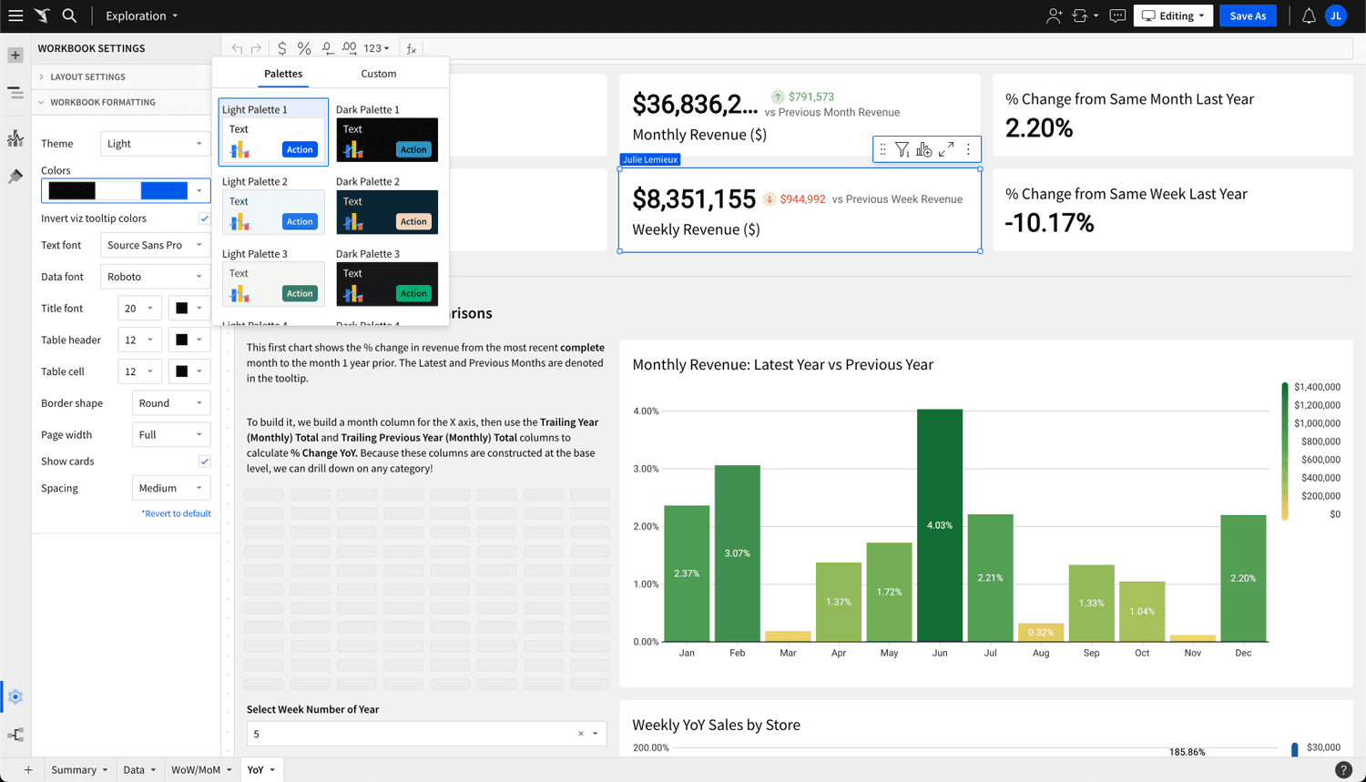
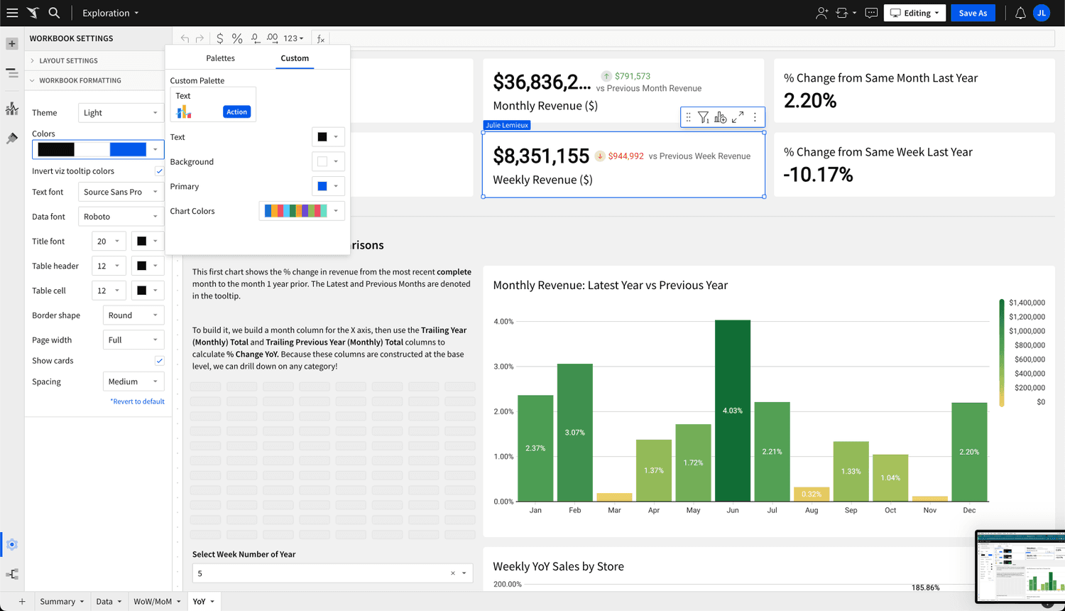
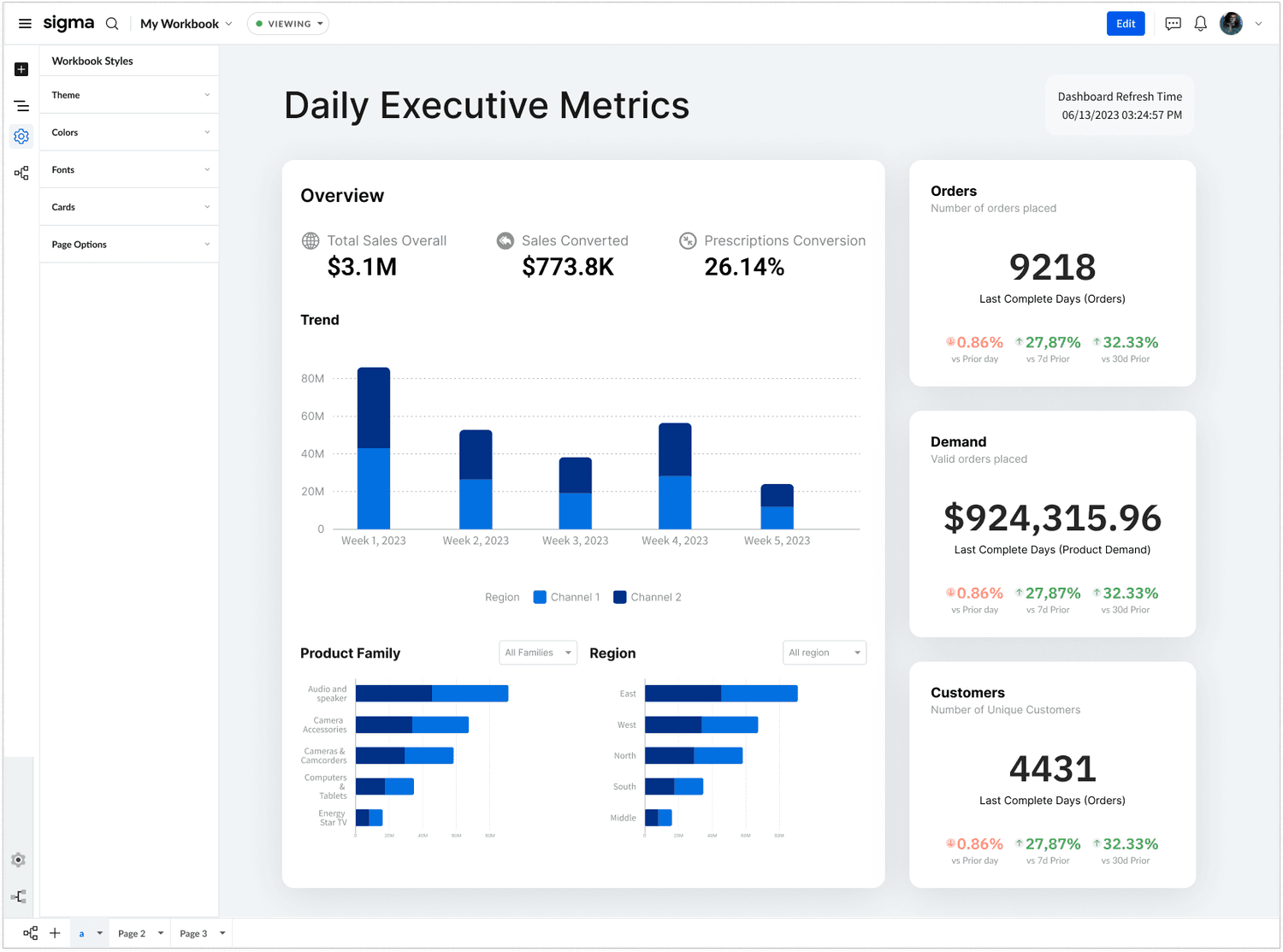
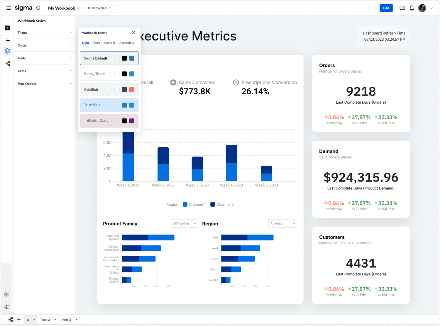
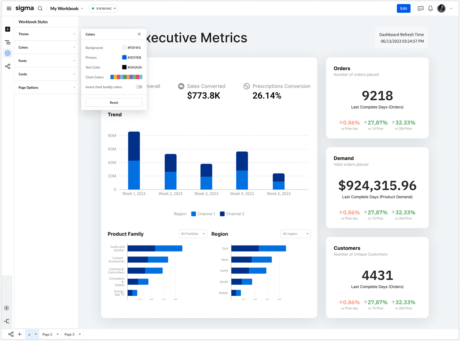
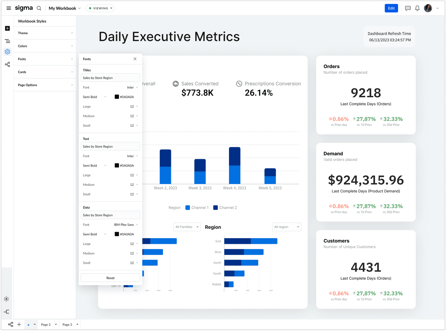
Workbook Styling Using the New Chrome UI

I was able to get some screenshots of the styling features as housed in the new UI Design. The design has progressed from where I left it. Notably, the team has opted to use a popup interaction rather than to and back from a panel with dedicated contents.

what's next?

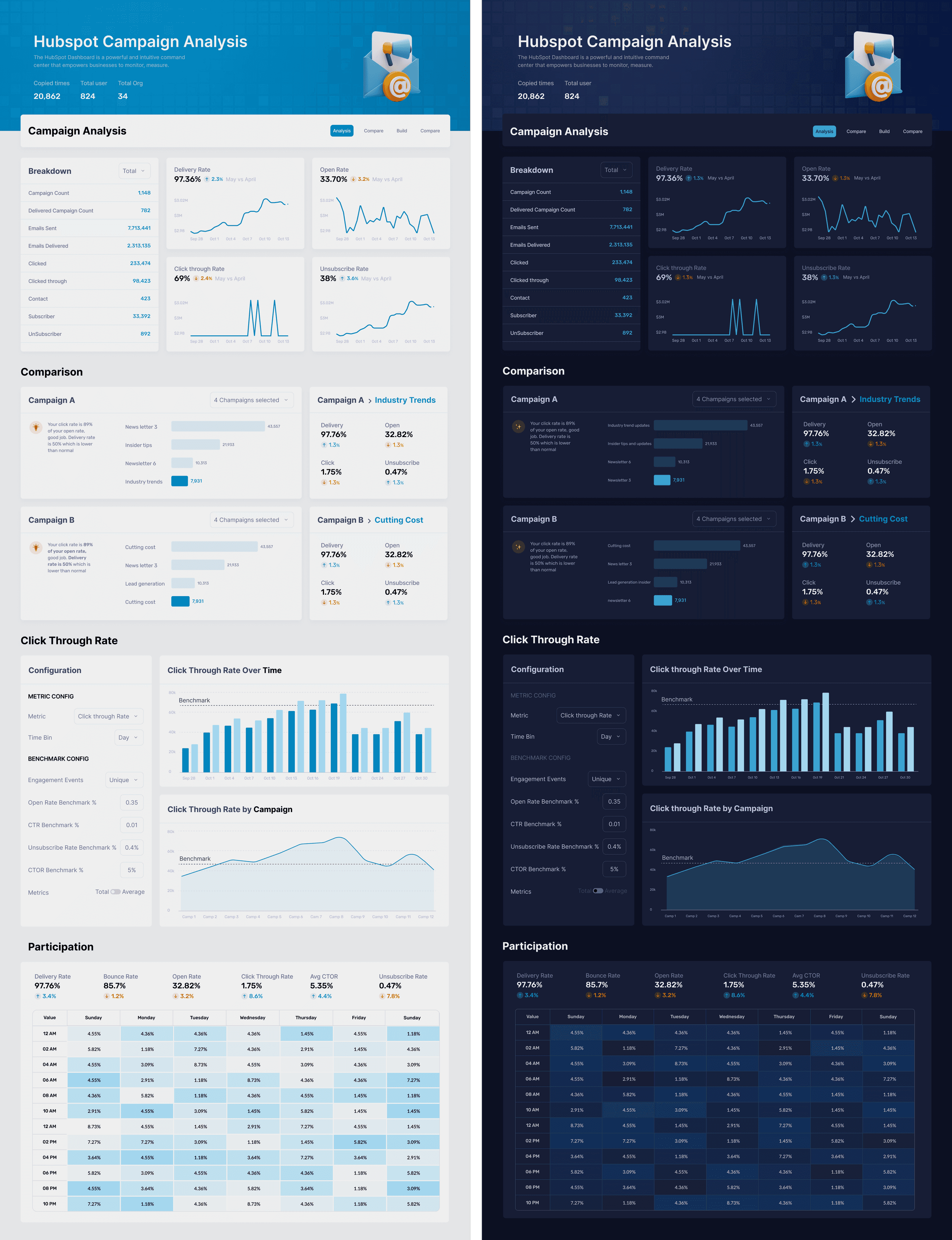
This is the vision that Sigma design is marching towards for executive dashboards. When the Fit & Finish project is complete, this is the kind of design that should be possible for users to assemble and present to their stakeholders, out of the box. Notably, new themes and a header element will need to be designed in order for Sigma’s customers to achieve these results. This mock up is showing the light and corresponding dark themes.