Mission & Operating Principles
As VP of Design at Sigma Computing, I wrote the below principles to help cross-functional colleagues understand our role and approach, as well as to help new design team members internalize the principles we would be using to guide and evaluate our work.
Sigma's Mission
At Sigma Computing, we envision a world where everyone can do meaningful real-time data analyses to fuel innovation, drive progress, and accelerate success. This is why we have made it our mission to deliver an A&BI solution that closes the data literacy gap and makes it easy for anyone to analyze real-time data, discover new insights, and make the best decisions possible in each moment. Simultaneously, we want to free data teams and analysts from report factory hell so they can leverage the power of data for complex, innovative, and fulfilling initiatives that propel individuals, organizations, and communities toward a better future.
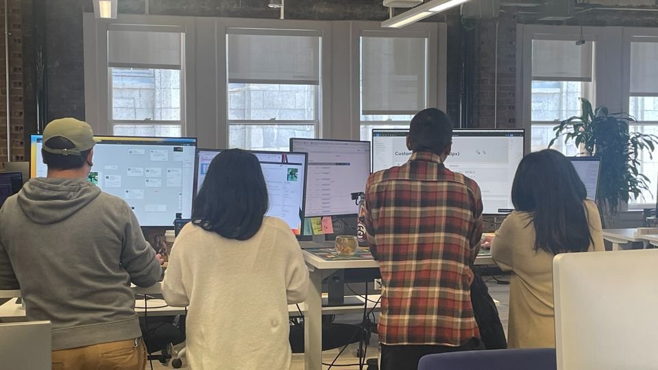
My Sigma team at work: a very common thing to see was UI Designer/Product Designer pairings collaborating at the screen.
Our Team's Role
We are in the business of understanding the people who use Sigma so that we may succeed at designing a BI and analytics product. The product must embrace people as they are and teach them the skills they need to succeed at exploring, analyzing and sharing data.
We take a human-centred approach to our work
Human-centred design is an approach to problem-solving that develops solutions to problems by involving the human perspective in all steps of the problem-solving process. We empathize deeply with our inherent humanity: the needs, feelings and challenges people encounter not only when using Sigma but also what may prevent them from fully engaging and actualizing their needs and objectives. We ask questions about people's feelings a great deal. We want to know what people are scared of, where they are resistant and what's fundamentally tricky as it relates to data analysis so we can mindfully address these challenges in our designs.
our operating principles
We focus on user needs
We build software for them — not ourselves
Our approach:
We know our customers. We know their goals, motivations, and what success looks like for them. We know they are smart, engaged, busy people who want answers. We design in service of their goals and we strive not just to fulfill their current needs but anticipate their next ones.
We identify what problem we're solving and we stick to it until its solved to the customers' satisfaction.
How you assess your design:
Does your design address the agreed upon problem to solve?
Which user goals does your design serve, and how?
What data/research did you use to develop your solutions?
How will you measure the effectiveness of your work in terms of user outcomes?
Sigma is a modern BI & analytics innovator
Our product look & feel must convey that to our customers
Our approach:
Sigma is a modern, cloud-native BI and analytics product. Our design philosophy favours light, airy, vibrant and spacious interfaces. Our components are drawn from the best open-source libraries. Our in-product artwork is clean and relevant to how we wish our product to be perceived in the market. If designs resemble traditional enterprises or one of the products we wish to displace in the market there are better designs for Sigma. We can borrow in small measure from the best of the best when warranted.
How you assess your design:
Looks we like: Airtable, Spotify, Tableau’s charts
Looks we avoid: Looker, Tableau’s interface, Power BI, BusinessObjects, Excel
Do your layouts feature white space for the user’s mind to rest?
What design system components are you using? Suppose you have created a new component or deviated from a component standard. How does the positive value it provides outweigh the negative, introducing a new UI element for the user to understand?
How does your design contribute to our modern look and feel goal?
Are you borrowing too liberally from products whose look and feel are antithetical to ours?
Data is king
It must ALWAYS be the star of the show
Our approach:
Sigma is all about users getting insights from data. They can't get insights if they can't see/use the data. If your design results in hidden data, or its comprehension is in any way impaired, it is unacceptable.
How you assess your design:
Tired: filter drawers that hide the underlying data table and visualization
Wired: filters that are always available to the user no matter what their context is
Do your designs ensure the user’s ability to see, work with and interpret their data? Is the data they need hiding in any way? Do your designs impair data comprehension in any way?
Does your design impede the user’s ability to get insights? How does it help their ability to gain insights?
We innovate in the right places
We spend our creative capital designing simple, innovative BI & analytics interactions
Our approach:
Sigma designers know when to innovate and (more importantly) when not to. We innovate to support the user in deriving insights from their data and to advance our departmental and company goals.
How you assess your design:
Innovation areas: Levels, charts, dashboards, worksheet interactions, data sources and other BI & analytics workflows and actions
Verboten: File management, navigation, lists, document headers, upload, steppers
Have you implemented best practices for everyday, standard interactions?
How does what I am working on advance our company or department goals or help the users achieve theirs?
We avoid anti-patterns like the plague
We stick to UX best practices so users have as little to learn as possible.
Our approach:
Sigma design does not throw its users curve balls. If we have to explain it, the design isn’t good enough. It is unacceptable if a non-BI interaction strays from standard web interaction design best practices. Anti-patterns are frowned upon at Sigma and should rarely, if ever, be considered unless there is an entirely defensible reason to do so.
How you assess your design:
How do we know? No usability tickets or intercom support requests were logged against the finder, navigation, document management, or admin features. None. Zero. Nada.
Look at the best out there. Do you see the interaction you’re proposing in their design systems? Have you seen it in your favourite commercially successful products? If so, go ahead and consider it. If not, tread carefully - anti-patterns await.
We strive for highly intuitive and usable designs
To paraphrase RuPaul, it better work
Our approach:
The bulk of our design efforts are spent on making it work.
How you assess your design:
Its gotta be bulletproof. Our designs must stand on their own and be inherently usable without explanation.
Features must score extremely high when their usability is measured. Low-scoring designs are never good enough.
Designs should be tested for their ease of use and comprehension
Prove to users that your designs function to their satisfaction and gain user acceptance of your work

©️ 2024, Julie Lynn Lemieux