Sigma Computing
re-enabling free trials
In late 2019, GTM asked product to remove free trials from the website. In 2021, in response to the successful Workbooks launch and increasing sales demand, GTM leadership requested that free trials be made available again.
context
2019: Why were trials turned off?
Line of Business (LOB) Users found the product too complex (hard to start, challenging to complete their use cases, cluttered, overwhelming UI)
Analytics & BI (A&BI) users had difficulty setting up the product (connecting a data source in particular)A&BI users had difficulty modelling data (mainly because of its state in the warehouse)
Participants invited others that sales had never spoken to and increased the number of people who could say “no” to Sigma. Sales lost control of the narrative.
why did gtm want them back?
Workbooks release in 2020 is a success. Sales are picking up.
Clogged TOFU: Not having trials clogged up the middle of the funnel. Demand Generation had nowhere to send people after their first engagement with Sigma
AEs didn’t have a place to direct prospects early in the sales cycle to begin their own POV - SEs had to manage the entire process manually, which was very expensive
the project
my role
I led the initiative from inception to completion; aligned senior leadership on the goals and KPIs of the initiative; defined and executed the strategy to research, design, develop and release a new trial experience in spring of 2021.
goals & KPIs
GTM’s requirements and our research insights delivered the trial goals:
Deliver a no-friction signup
Fully onboard the user
Complete their core ad hoc analysis use cases with their own data
Present opportunities for the user to take the next steps with Sigma throughout
We turned to our head of Demand Generation to help us align to one single KPI: 25% Trial-to-SQL conversion rate*
* This is an industry best. We opted to shoot for the moon with the KPI, so we always had something huge to shoot for, no matter how good that initial rollout number was. After 6 months, we were hitting a 14% conversion rate
the strategy
Focus: Define ONE KPI for the project
Keep the design and development scope as simple as possible by re-using as much of the codebase as possible
Actively teach product basics as part of the trial
Encourage contact with Sales at every stage of the trial
Allow users to choose their path through the trial
Disallow signups for prospects already engaged in the sales process with AEs
research
Now that we had a mental model for what problems we were solving (and, more importantly, why we needed to solve them), we started the active design process by laying out a flow concept proposal. We decided to try and onboard the user progressively through the trial.
After internalizing the research insights, it became clear to the team that we needed to tie the trial flow to the newly defined onboarding stages. Further, when we examined the onboarding stages alongside the challenges users had completing the original free trial, we saw that we could solve many of those issues if we followed the trial stages in the tutorial. We would try to heal two birds with the same bandage.
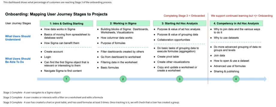
Stage 1: Users are unclear exactly what Sigma is and what it does. The mental model for Sigma is 100% different than that of Excel (cell-based vs column-based being the biggest difference)
Stage 2: Excel skills are not immediately useful - users don’t know how to perform the basics
Stage 3: Users don’t know how to “play” with the product to understand if it will meet their business needsUsers need to experience the product using their own data to perform an analysis that is directly relevant to them
Iteration 1: Simple Flow Concept
We purposefully left out the weedy details so our stakeholders in DG, PM, and Engineering would not rathole into technical details that we were not yet ready to explore. We iterated on the high-level flow several times before full stakeholder alignment. Our biggest challenge was how to map the onboarding steps into a trial framework that users can get through quickly and be fully onboarded by the end.
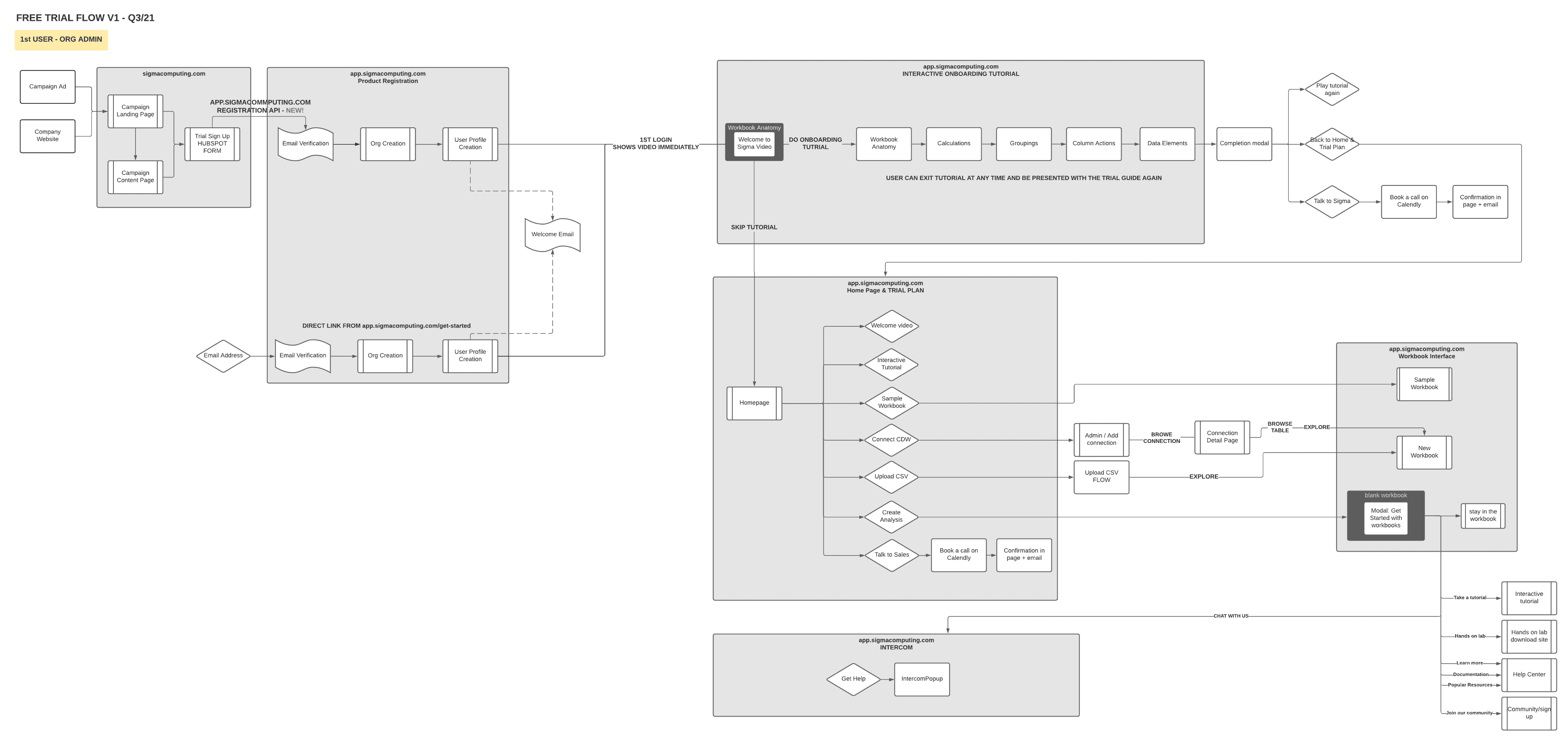
Iteration 2: Detailed System Flow
Once the team was aligned on the flow concept, we moved to a more detailed flow to work through with engineers. In this flow, I made sure to detail the DG email touchpoints and as many of the backend system interactions as possible. I iterated with the lead designer and lead engineer several times before presenting the flow to DG so they could sign off on the email sequencing and user behaviour triggers.
experience design
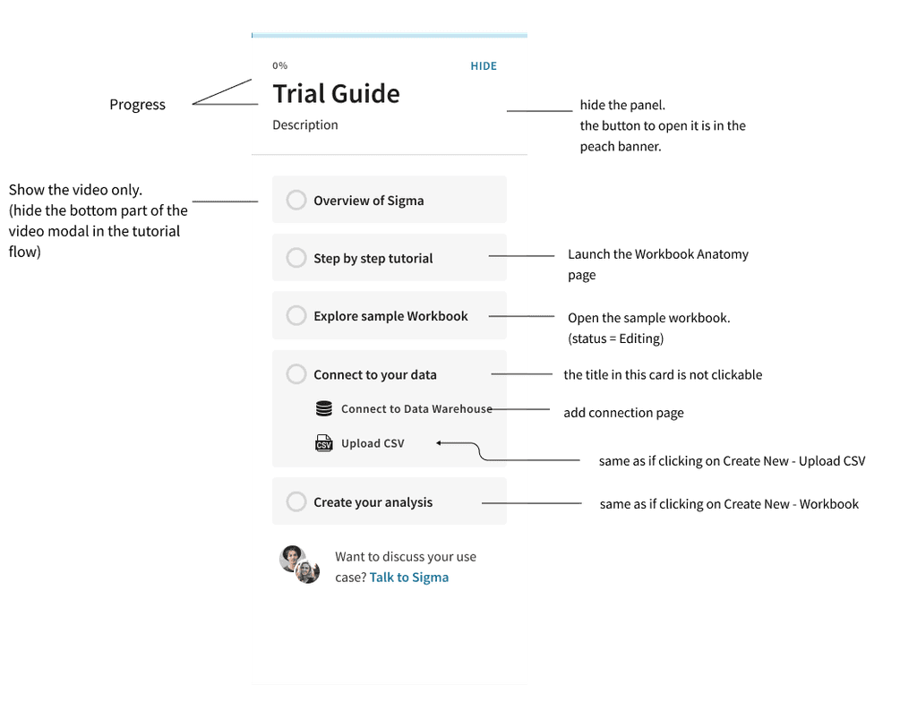
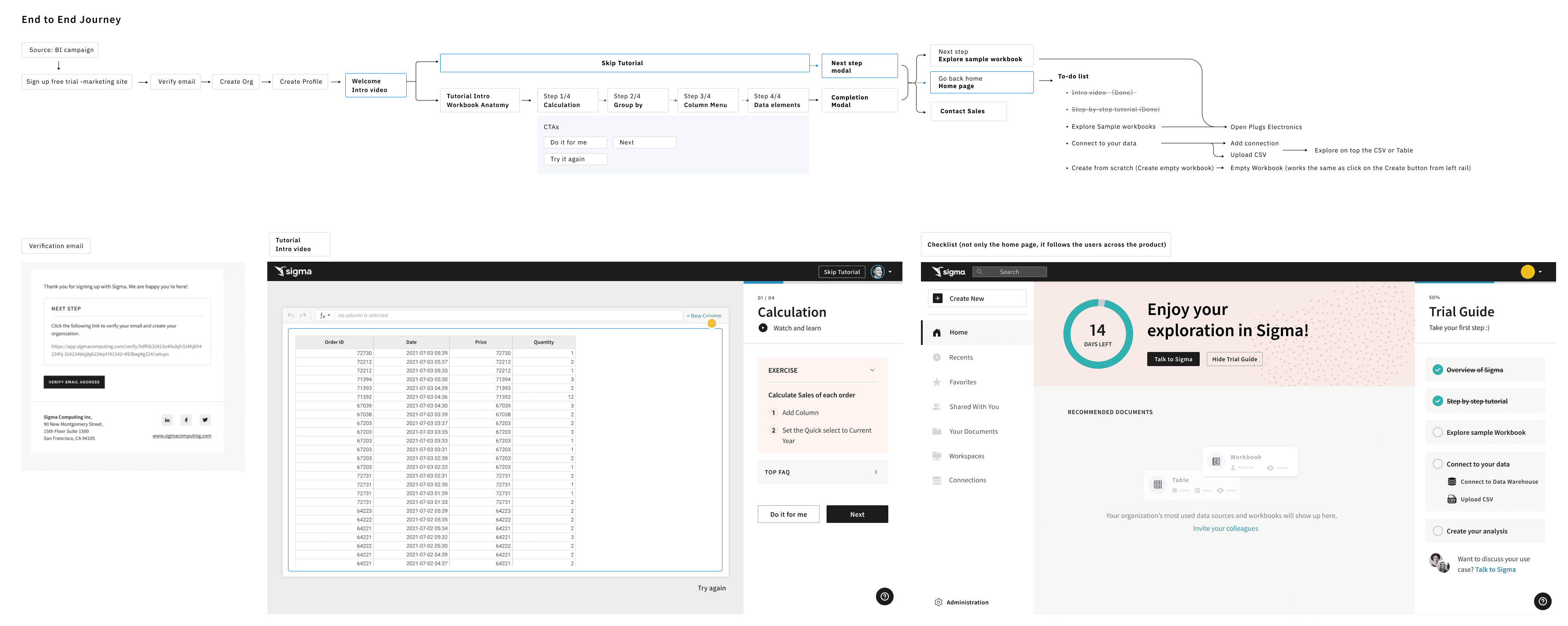
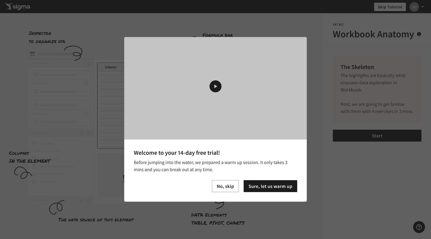
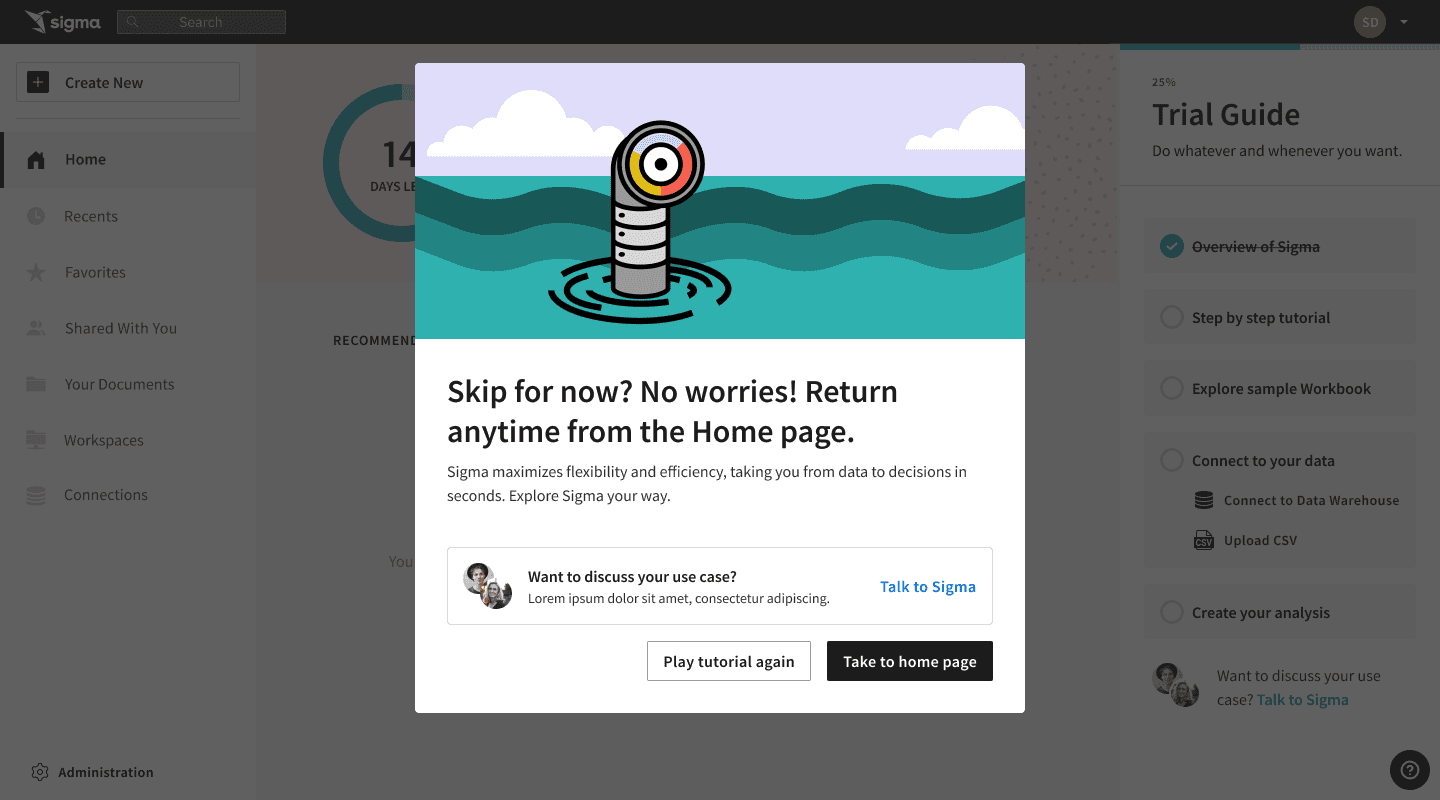
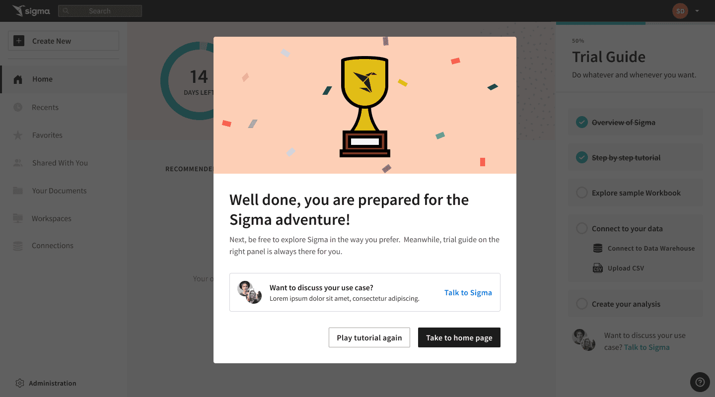
Our next step was representing the top-level steps in the trial flow in a rudimentary UI. After many iterations of displaying this, we landed on a checklist approach. This checklist is a spruced-up stepper — nothing novel in this UI. We chose this specific display mechanism to solve one of the biggest challenges identified by UXR: Users don’t know how to try the product effectively. The checklist is a transparent way to inform the user of what to do to evaluate the product while allowing them to take whatever path they choose.
Interaction design approach: Self-guided checklist
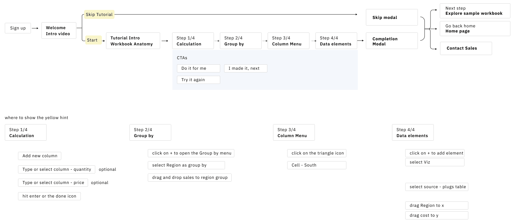
We decided to guide the user through the trial in a progressive manner using a checklist*:Overview of Sigma, how it functions, and significant differences between Sigma and Excel. Mechanism: videoStep-by-step tutorial on how to perform core analysis tasks. Mechanism: a tutorial using the live productExploration of a pre-built analysis that reflects a relevant business case. Mechanism: Pre-built WorkbookStep-by-step guidance on how to connect a data source (or upload data via CSV)Step-by-step guidance on how to perform their analysis with the newly connected/uploaded data
*We chose not to force the user to complete the trial sequentially. We decided to allow users to select the topics that were relevant to them, allowing more confident users to skip topics that they didn’t feel were needed.
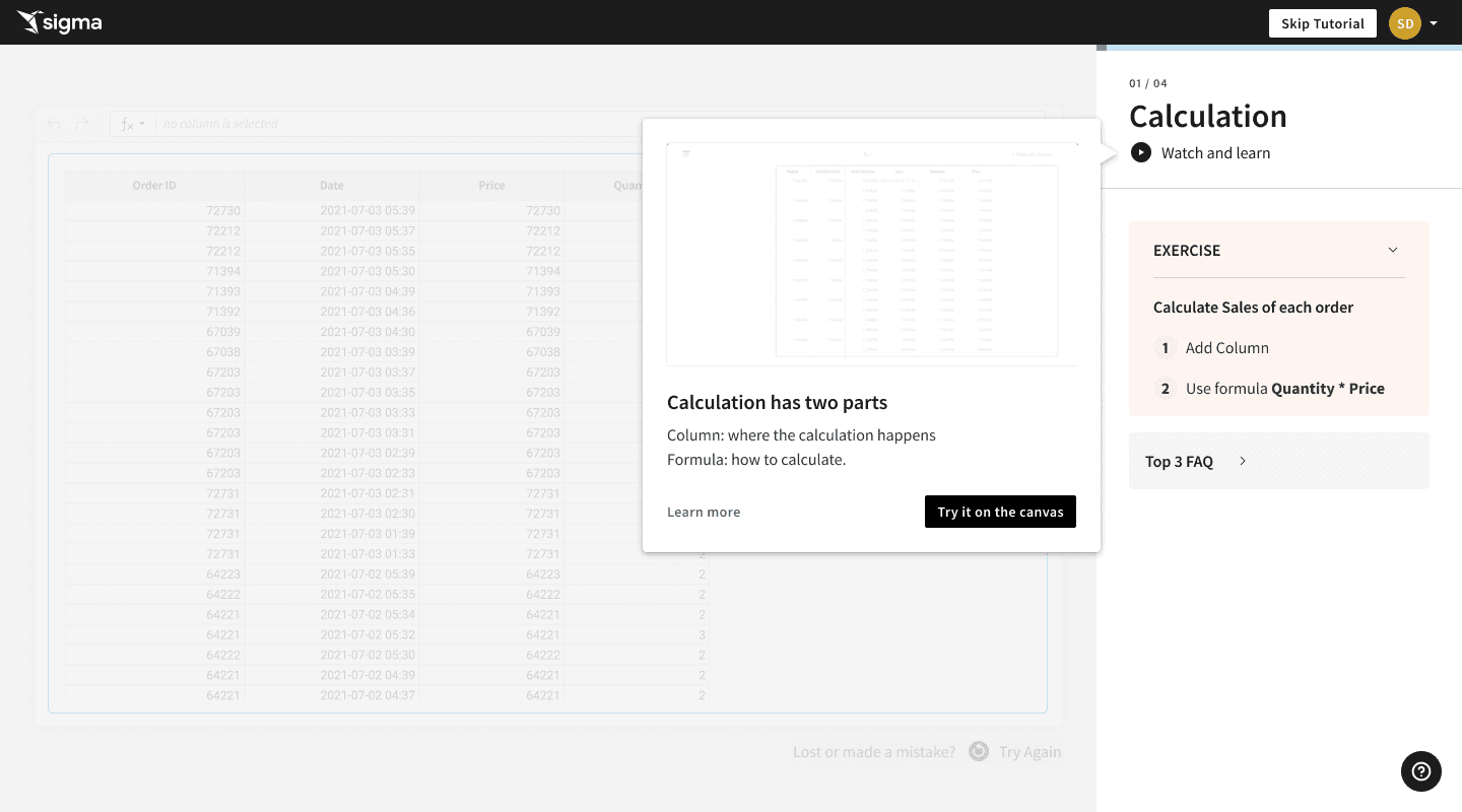
the tutorial
The majority of our design time was spent on the tutorial, where the user will spend the majority of their onboarding time. The tutorial spans the know/do requirements in Onboarding stages 2 and 3. We started by designing the trial journey, highlighting where the tutorial would fit. Presenting the entire concept visually helped effectively communicate our vision to the rest of our team.
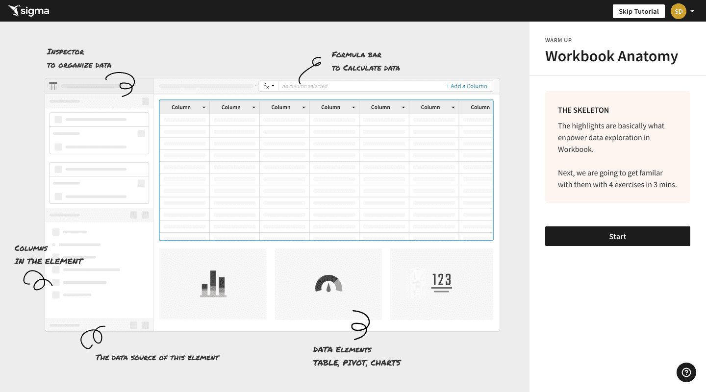
The Canvas
Except for the tutorial, the rest of the trial interactions are simple navigation. We opted to detail those last so that we could focus heavily on the tutorial itself, being that it was a new design that required new code to function as designed.
This feature could have been a very onerous development project. It was not. We stripped out extra analytics features not needed for the tutorial and re-used the Workbooks codebase. Zip-zip. :)
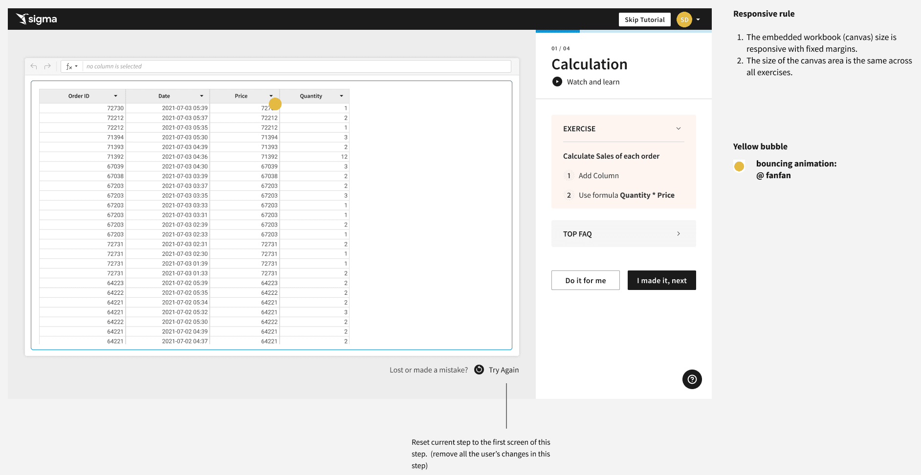
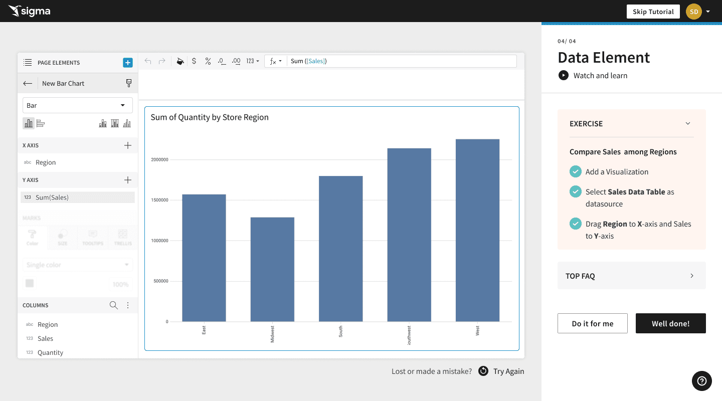
Tutorial Right-Hand Panel
We detailed the tutorial right-hand panel interactions as part of this process. We included the following learning elements in the panel to make sure that we could reach as many types as possible:
Step count - answers the very human “ugh, how long is this going to be” reaction to tutorials in general
“Watch and learn” - video content demonstrating the skill
“Exercise” - the exact steps needed to execute the skill
“Top FAQ” - because people always have questions, we opted to answer them within the tutorial (because who wants to leave the UX and go to the docs to answer simple questions?
“Do it for me” - some users reported they wanted to “watch” the UI perform the task rather than the video before trying it
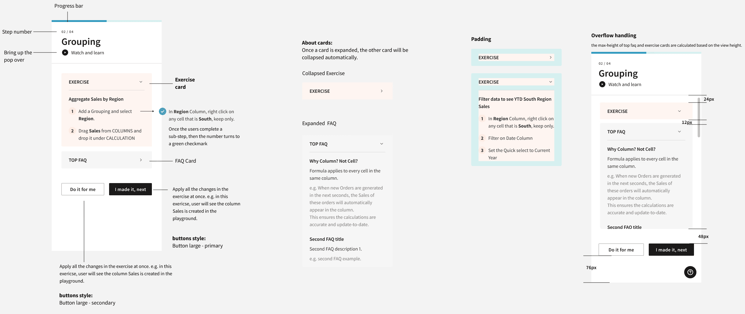
Design prototype
Once we had the interactions laid in, the next step was to create a Figma prototype of the tutorial so that our colleagues could click through it to get feedback on how that specific experience felt to them. Too complex? Not helpful? Too pedantic? After several rounds of feedback and prototype iterations, we landed on this tutorial flow.
end-to-end experience
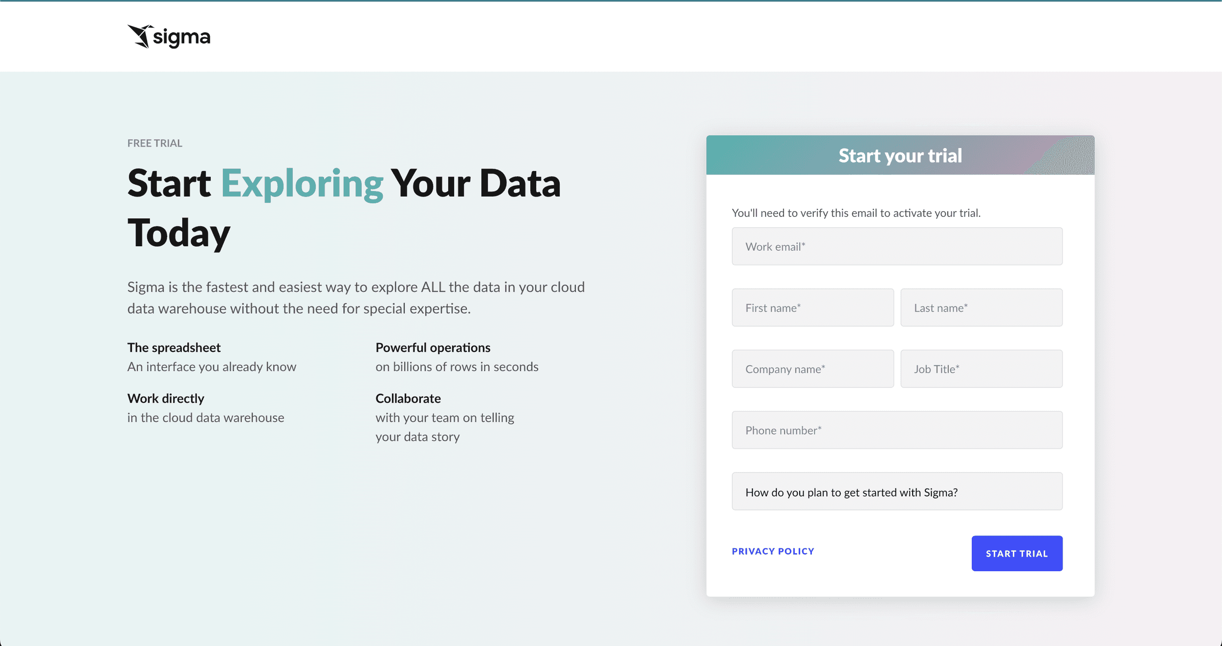
Once Engineering started working on the new code for the tutorial, we got to work designing the non-interactive portions of the Trial Experience, as those would be simple to implement once the designs and content were complete. Our lead product designer handed off wireframes on the project to the UI designer for final design and polish.

©️ 2024, Julie Lynn Lemieux